


Starbucks | How Starbucks uses design and brand image strategically
Starbucks’ design and brand image over time
1971 was the year in which Terry Heckler designed the company’s first logo. It featured a 15th-century siren enclosed within a brown circle. The image combined wood tones with a female figure, so local consumers — especially men working at the Washington port — responded very positively to it.
However, the owner of Starbucks wanted the company to grow much bigger, and for that it had to evolve. A logo featuring a woman with bare breasts was not suitable for a family-oriented business. So, in a second stage, the siren’s chest was covered by her hair so that it could travel on the company’s distribution trucks. This was not the final change to the logo. Quite the opposite: in the 1980s, the siren lost her extremities. A smiling face welcomed customers into Starbucks stores and gave them a warm reception. We can see how the evolution of the logo has faithfully reflected the evolution of the brand over time.

Starbucks and coffee: a turning point in design and brand image
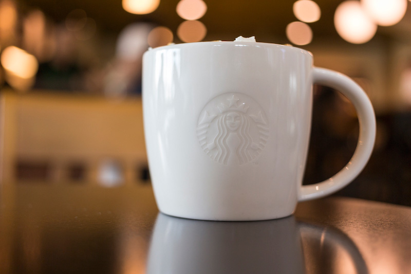
In 2011, the brand underwent what was perhaps its boldest redesign. It was only seven years ago that the word coffee was removed from the logo. In addition, the circle surrounding the siren was also eliminated. On the one hand, the disappearance of the circle made the siren feel more approachable and welcoming. But what stands out most is the removal of the word coffee. There were several reasons for this.
First of all, by 2011 Starbucks was already a company that everyone, anywhere in the world, associated with coffee. The word had therefore become redundant and unnecessary.
On the other hand, Starbucks had significantly diversified its business. It now sold many more products, such as food, tea, and sweets. But above all, Starbucks has gone from being a beverage seller to becoming a lifestyle brand.
Removing elements from the logo whose purpose was to limit its meaning transformed it into a universal, global symbol. The company’s brand image was not only strengthened by the logo redesign, but its meaning changed completely.
If you are interested in design and would like to learn how to carry out this type of process yourself, take a look at our Master’s in Branding, Creativity and Brand Communication. Design and brand image are part of one of the most fascinating disciplines within design. Today, many of our purchasing decisions are shaped by both. Learn how to work strategically with them and become part of the creative side.


